Case Study
Sophia Learning
Education, Marketing, Free Trial
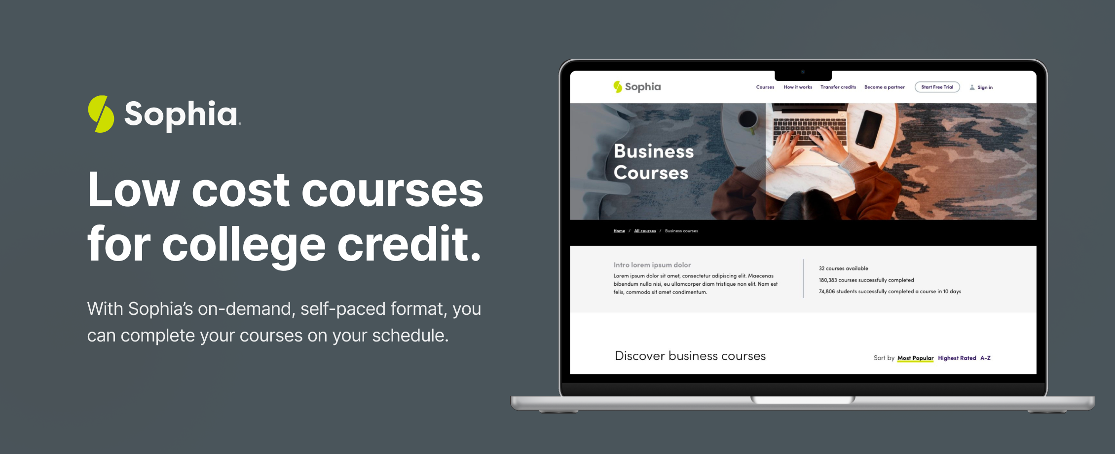
Redesigned Sophia.org website, later saving students one billion in tuition. Read the article on BusinessWire Jun 5, 2025 8:01 AM Eastern Daylight Time
SUMMARY
Sophia Learning has transformed its website to drive revenue growth and boost user engagement across multiple segments. This revitalization centered on modernizing the brand, optimizing information architecture, and showcasing the free trial offer. We ensured team alignment and adherence to best practices while developing journey maps, wireframes, style tiles, and a design system to effectively represent the brand refresh.
Target users
Tech-savvy learners seeking quick access to educational resources
Students looking for affordable and flexible learning options
Educational institutions and partners aiming for streamlined enrollment and engagement
Business goals
Enhance user experience to increase trial sign-ups and conversions
Simplify navigation and information architecture for better user retention
Strengthen brand presence through effective marketing of free trial offerings
Core problem solved
Users often face confusion navigating outdated website designs that hinder access to valuable educational information. Sophia Learning addresses this issue by modernizing the user interface, making it intuitive and user-friendly, thus facilitating smoother access to courses and resources.
User flows
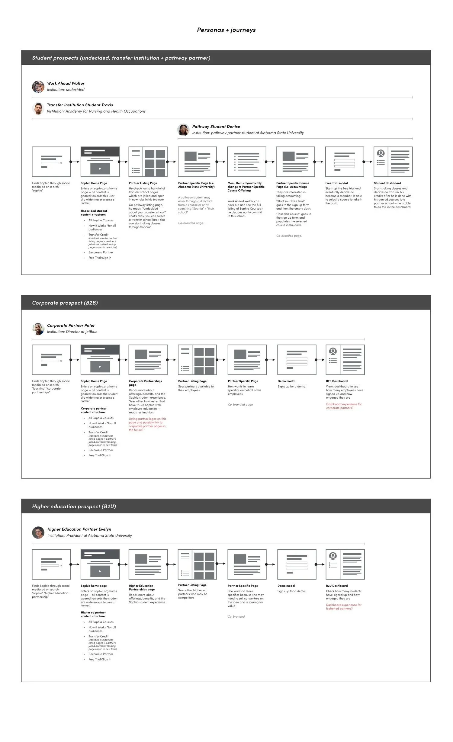
Key UX requirements
As a student, I want an intuitive online platform that simplifies my course selection and enrollment process so I can quickly access the education I need.
As a user, I want a clear and prominent free trial option on the website so I can easily try out the services before committing to a full subscription.
As an educational institution, I want an easy-to-navigate interface that showcases our offerings so I can effectively engage with potential students and increase enrollment.
As a business partner, I want an understanding of the Sophia Learning platform so I can offer my employees access to high-quality educational resources and enhance their professional development.
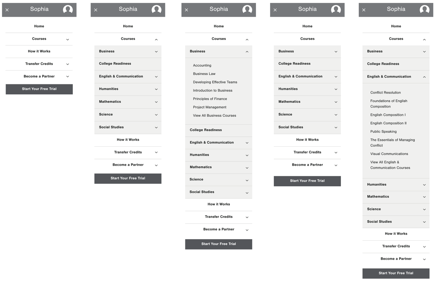
Lo-FI Wireframes
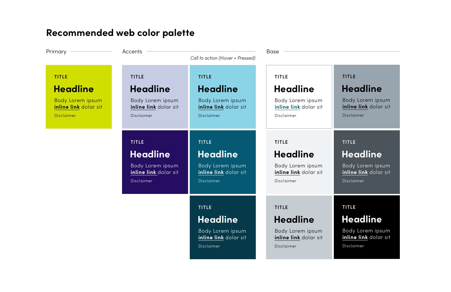
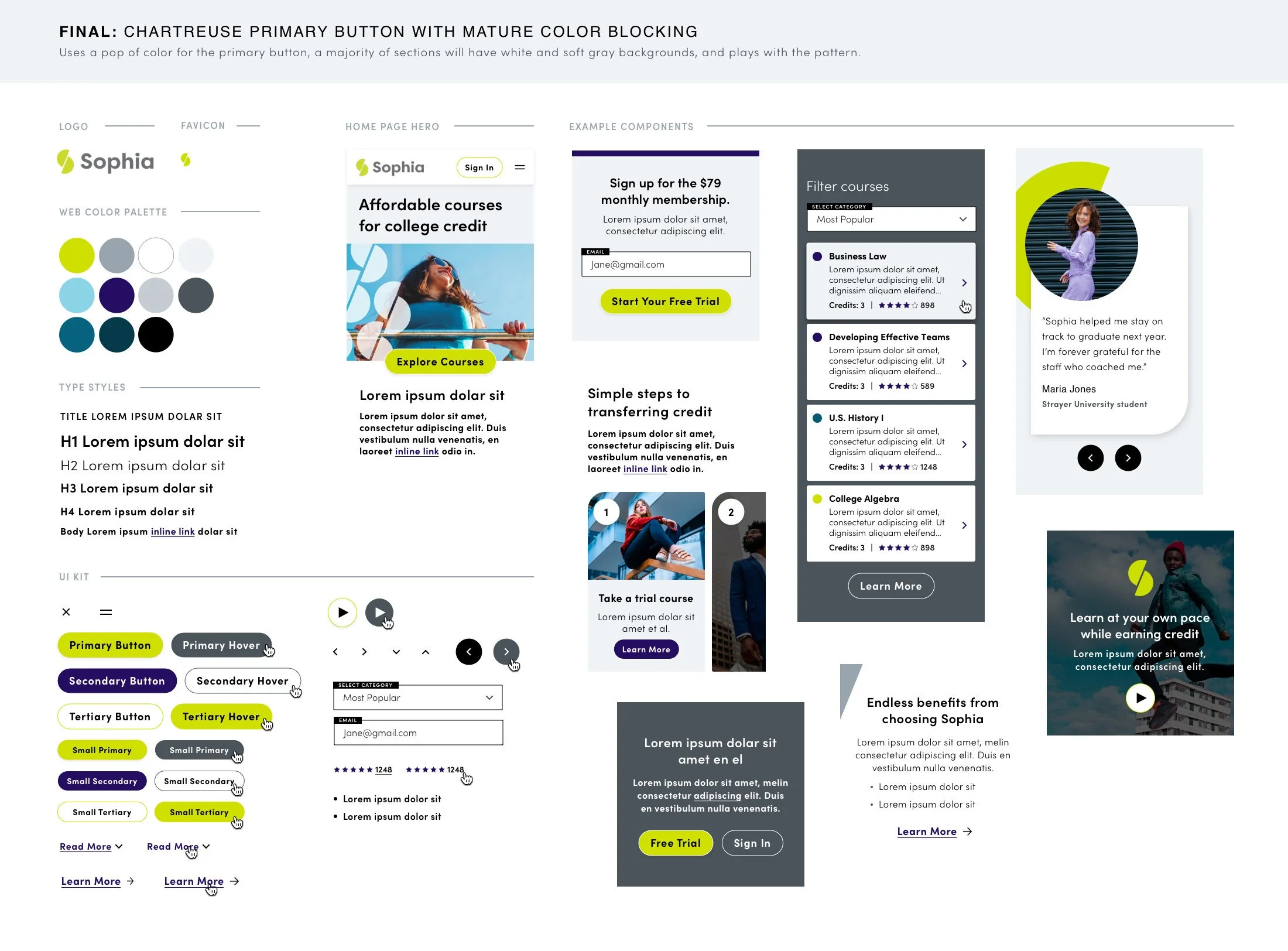
Design system foundations
Style Tile
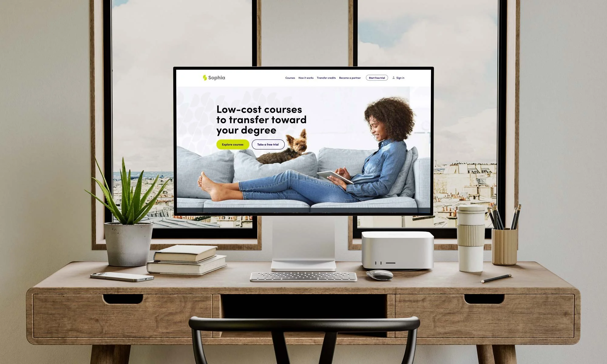
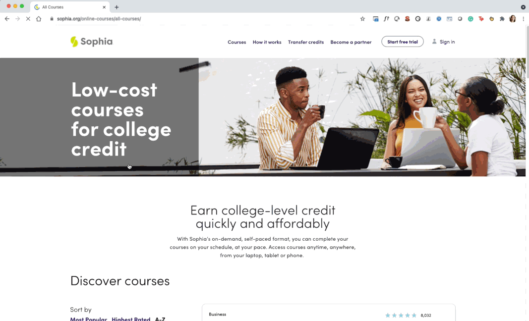
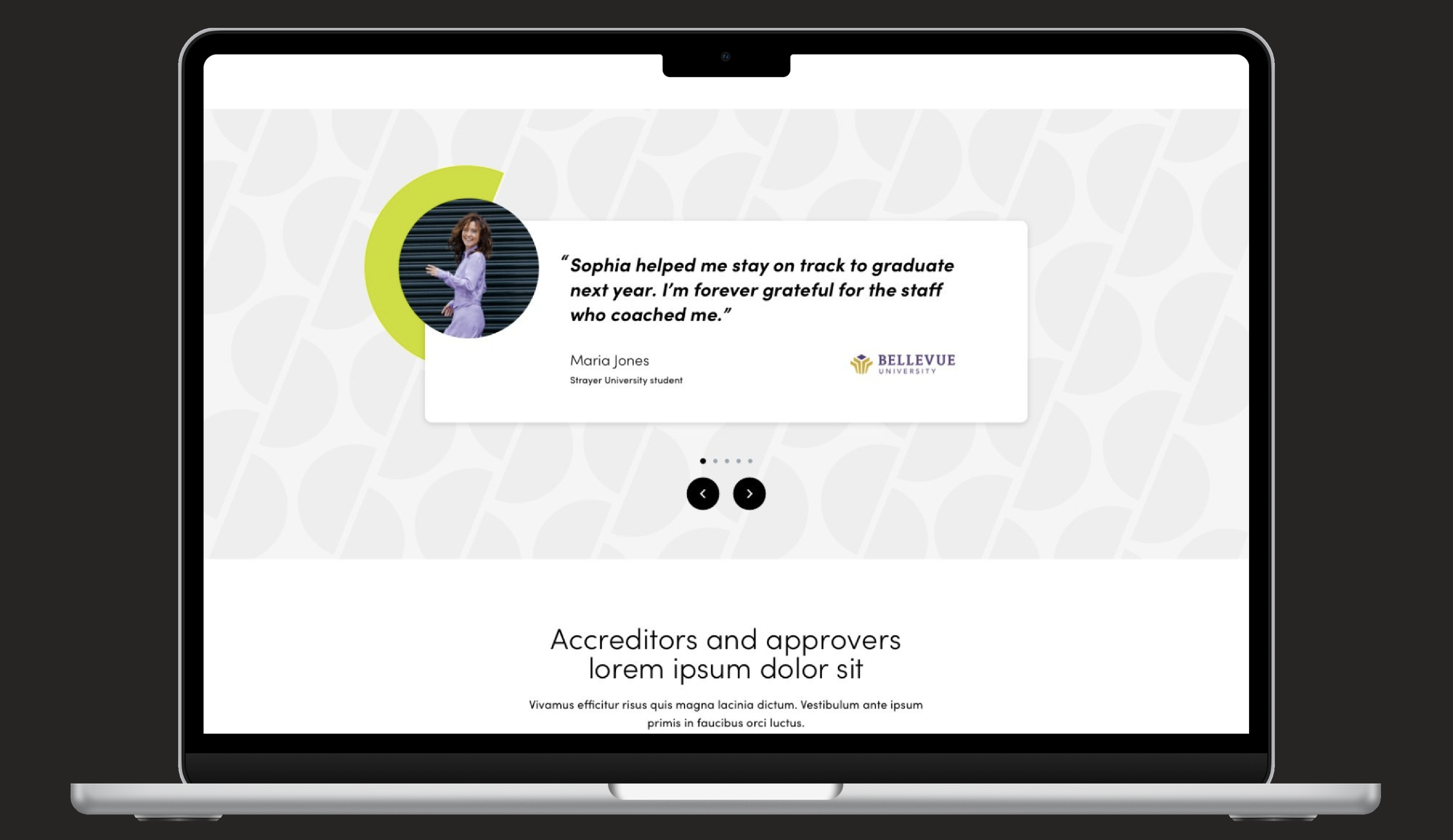
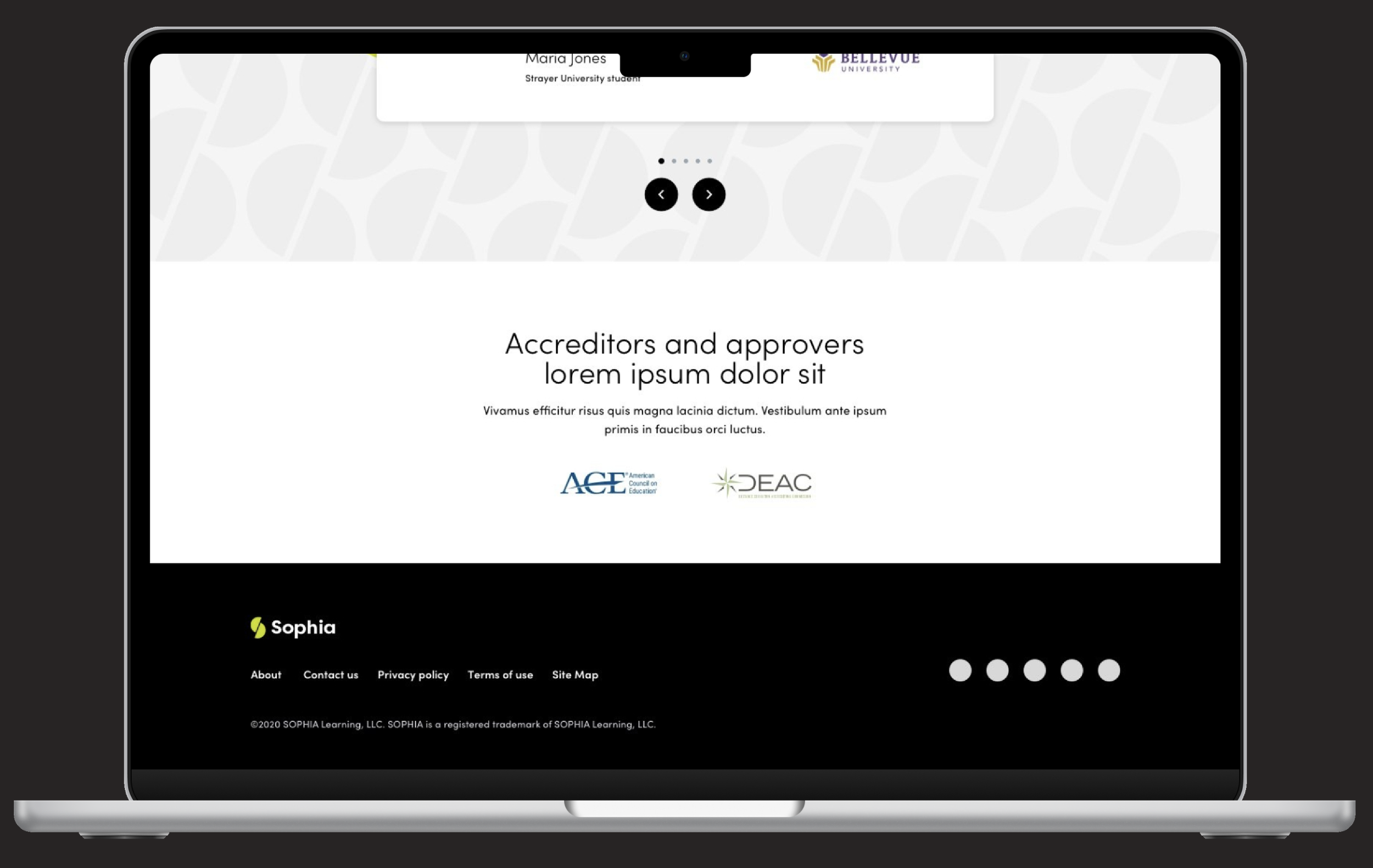
Desktop design
Home Page
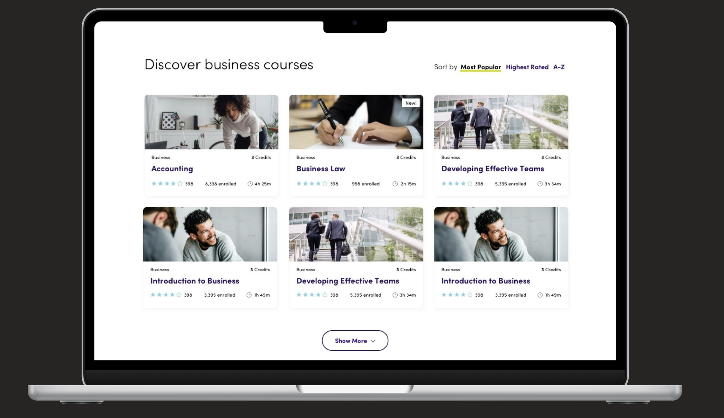
All Courses Page and filter
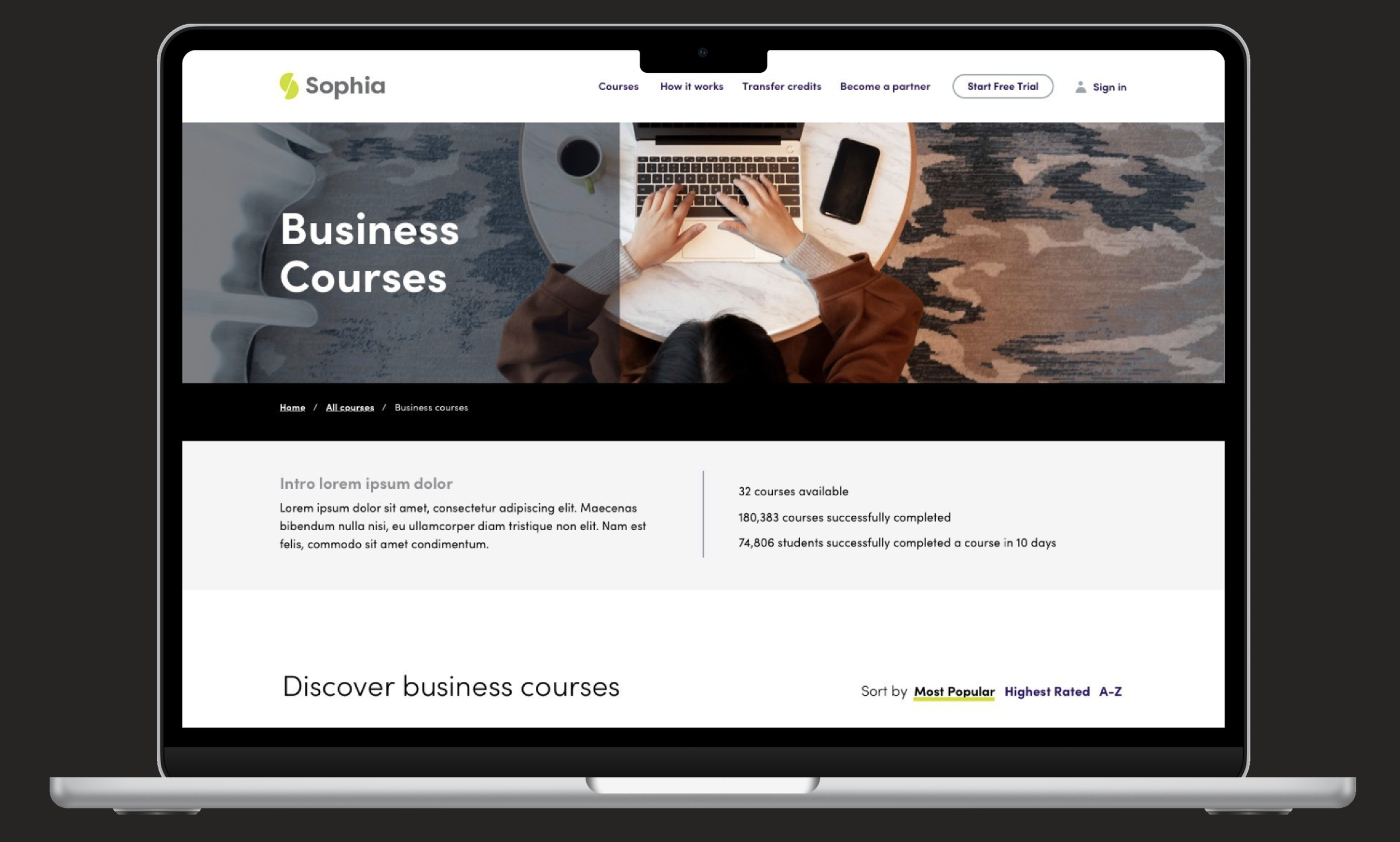
LAPTOP design
Course Category page
Reflection
Lessons learned: User feedback underscored the need for clear communication about course offerings and enrollment processes. Engaging learners in usability testing revealed areas for improving navigation and enhancing resource discoverability.
Improvements: Prioritize simplifying the onboarding process for new users—particularly around course selection and free trial sign-up—to minimize friction. Additionally, refining the user interface design for better clarity in course details could boost overall satisfaction.
Open questions: How can we further enhance the platform's accessibility for students with varying needs? What additional features or incentives could improve engagement and retention among diverse learner groups?
Next steps
Roll out the updated website with enhanced onboarding and clearer information about courses and trials.
Conduct further usability testing with a focus on gathering insights from a diverse range of students to ensure a more inclusive experience.
Investigate additional support options, such as live chat or FAQ enhancements, to better assist users through the learning journey.
Team
Design Manager: Jake King
Design Supervisor: Kate Bateman
Senior Product Designer: Jamie Braith
SEO & Information Architecture: Collective Measures
Agency responsible for rebrand: Hill Holliday
The content in this project is for placement only and may not be a current offering of Strategic Education or Sophia Learning.